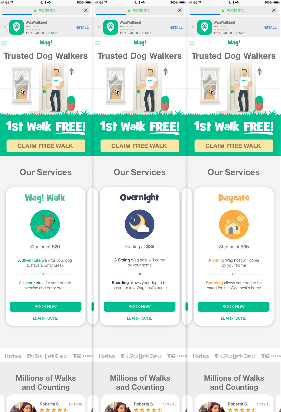
Web (responsive)
Project Context:
The product team wanted to grow the website and increase visitors and users. The mobile app had strong user rates, but the website was not doing as well. On top of that, we wanted to realign the website to be more in sync design-wise with our mobile apps.
Action:
Research
The CEO and VP of marketing wanted to understand whether or not we should change the website to lifestyle images or keep it illustration-based. Users claimed to like photos more, but their click-through rate was higher on our illustration-based versions according to our A/B tests. We also found that we needed to include new descriptions of our current services. Heat maps indicated that more user attention was paid above the fold. These few points helped influence our redesign.
We had 1 week and were limited by a lack of in-depth research. The quickest way forward was to focus on what was most needed: updating the hero illustration, make our prices transparent, clarify descriptions of each service and push users below the fold to increase user engagement. For references and inspiration, I looked at service-based websites like GoDaddy and Lemonade, as well as Dribbble.
Design inspiration from other designer solving problems on service description.
Design Exploration
With well designed, clear descriptions of their products, GoDaddy and Lemonade’s work aligned well with our needs. I created the first iteration of the hero image changing the female walker illustration to a male walker. We did this because most users believed that most of our walkers were female, and were surprised when a male walker would show up to walk their dog. The goal was to use a male walker to show that we have male walkers as well, and they can be just as reliable and warm as our female walkers.
After designing the hero image, I started working on the services section. This time we placed our multiple services above the fold, which got users to scroll down and explore the services we provided.
Hero design ideas.
The first iteration of the service description designs I have made.
My product manager narrowed my designs down to two. We uncluttered the hero image, and enlarged the CTA and “Become a Walker” buttons to improve awareness and facilitate more signups. For each product card, we added an extended information section to help users understand our offerings. A new navigation bar was added to help users find services.
The second iteration to the landing page.
We removed the “Steps” scroll down information section when we found that we could create more landing pages. After completing the desktop version, my next step was to make it responsive in mobile and iPad (no image) version. Finally we tested the conversion rates of the new designs.
Mobile web version.
Result:
The redesign led to increasing unique visitors by 43%, from 3.5 million to 5 million, with a 15% growth in Wag! overnight services.
Reflection:
I learned that it’s difficult to trust what users are saying. It’s a cliche, but actions speak louder than words. Although it’s useful to talk to users, A/B testing reveals much more about what users actually do than what they say they do. We saw that they said they liked one thing—the lifestyle images, and maybe they did visually, but illustration-based designs prompted more action from them.


